Optimize for Mobile
Mobile isn’t an afterthought—it’s where your customers live. We design responsive experiences that feel natural on phones, tablets, and desktops, so every visitor gets the best version of your site.
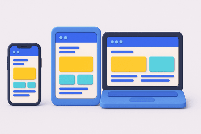
Responsive Web Design
Responsive web design services for mobile-first experiences. Web design that works perfectly on every device and screen size.

Mobile-first web design that works perfectly on every device and screen size
Half your users are on mobile, but most websites still feel like desktop sites crammed into a phone screen.
Responsive web design isn't just about making things smaller—it's about creating experiences that work naturally on every device, from phones to tablets to large desktop monitors.
From mobile frustration to seamless experiences
Your website doesn't work properly on mobile devices, causing high bounce rates. Users struggle with tiny buttons and unreadable text on phones. Your site loads slowly on mobile connections. Meanwhile, competitors with mobile-optimized sites are capturing your mobile traffic and converting better.
Websites that don't work properly on mobile devices and tablets
Poor mobile performance that frustrates users with slow loading times
Inconsistent experiences across different screen sizes and orientations
Touch interfaces that are difficult to use on phones and tablets
Desktop-focused designs that ignore mobile user behavior patterns
Design approaches that prioritize mobile user experiences
Layouts that adapt beautifully to any screen size
Interactive elements designed for finger navigation
Fast-loading responsive sites that work on slower connections
Comprehensive validation across devices and browsers
Our disciplined approach behind making the practical feel magical
Understand your audience's device usage and behavior patterns
Design responsive experiences starting with mobile constraints
Build adaptive designs that work across all screen sizes
Ensure responsive sites load quickly on all devices
Validate experiences across phones, tablets, and desktop computers
Mobile isn’t an afterthought—it’s where your customers live. We design responsive experiences that feel natural on phones, tablets, and desktops, so every visitor gets the best version of your site.

Web Strategy, Built to Adapt
Before coding a single breakpoint, we help you analyze device usage, plan responsive architectures, and create web experiences that work beautifully everywhere. Whether you need strategic planning, complete development, or mobile optimization — we meet you where you are.

Planning and consultation for mobile-first web experiences
Complete responsive website implementation across all devices

Transform existing websites for better mobile performance
Engagement spans from design reviews to full cross-device rebuilds.
Stop losing customers to clunky mobile experiences. With mobile-first design and performance optimization, we’ll make sure your site works beautifully everywhere—from rural 4G to widescreen monitors.

Article•
Explore how Digital Twins are transforming smart transportation through predictive maintenance, AI integration, and vendor-neutral system design; powered by semantic modeling and knowledge graphs.
Article•
Explore how Digital Twins are transforming smart transportation through predictive maintenance, AI integration, and vendor-neutral system design; powered by semantic modeling and knowledge graphs.